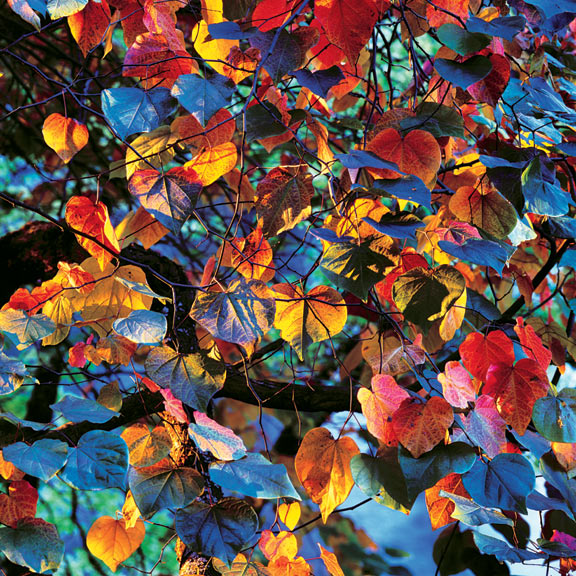
Resplendent Leaves at Sunset
Oregon

20×20″ prints are $4,000
30×30″ prints are $8,000
In 2002 we moved my photo studio and darkroom from Vernonia, Oregon to Milwaukie, Oregon. We purchased a neglected building, spent nine months renovating it and then in September moved all of the equipment and furnishings. It took one month to install and recalibrate the darkroom equipment, Kreonite processor and two Durst 8x10 color enlargers.
Obviously, that year we could not go on a fall photo trip across the county but I was highly motivated to do whatever photography I could on a day-by-day basis. So one bright non-windy day Ruth and I went to Crystal Springs Rhododendron Gardens only four miles from our new studio.
It was not busy there, being the middle of the week, and I only had my Hasselblad outfit with us. We spent about 2 hours looking for photos but I just wasn’t finding anything that came together to make a strong image. The sun was starting to go down and rather dejectedly we decided to go return home.
Just as we started up the final exit ramp, the sun broke through the trees in the distance and illuminated this Sweet Gum tree, a special variety named Forest Flame. It certainly was at that moment
I quickly pulled out my 205TCC Hasselblad with the 250mm Superachromat lens on it, set it up on the tripod and using the built in 1° spot meter was able to make three identical exposures of this scene as the light changed, the second one being the best. The special light was changing so quickly that within one minute of setting up the camera it was gone. I compose my photographic images completely intuitively, which worked well in this situation.
Since the sunlight was coming through a small opening in the trees about 100 yards beyond the tree, it cast extremely sharp, well defined shadows on the scene. This, combined with the blue light from the sky above, made a “perfect storm” of hot and cold light which intensified all the colors of the tree.
Our perception of color has as much to do with colors which are next to each other as it does with the technical measurement of color values. While one’s initial impression of this Cibachrome print is that the colors are quite saturated, most are not. It is the color contrast of the lighting on the leaf colors which bring out the intensity.
Printing this image requires a very precise overall color balance, to preserve this color contrast of every color and careful dodging and burning of each print to balance out the densities and bring everything into a cohesive whole. I’m always amazed when I study this Cibachrome print at the juxtaposition of colors, shapes and tones.
It is as if a wild basket of autumn leaves were tossed into the air and as they came down they were photographed in perfect relationship to one another. We could try that a thousand times and never come up with the grace filled moment that we see here.