Forest Flame
Oregon
24×20″ prints are $1,500
40×30″ prints are $3,000
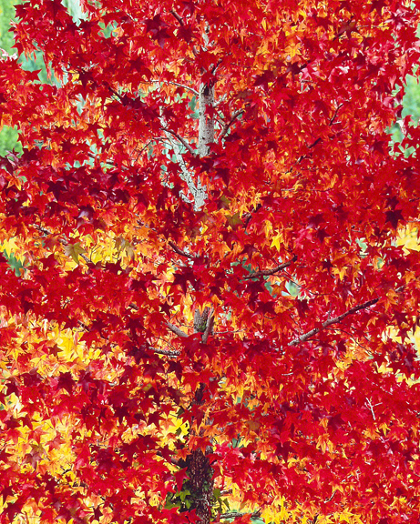
In 2008 I wasn’t able to go on a photo trip so I went out from time to time to see what I could see. I found this maple one sunny afternoon in September. It was only 2 miles from our home and was growing at the edge of a forested area which you can see in the background.
The stunning rea and yellow leaves were mostly backlit and had tier after tier of branches of red stars showing various densities as the sunlight passed through the tree. I have never seen a tree that looked so aflame. Not a fire that burns but an expression of fiery life force.
I used my 800mm Apo-Tele-Xenar lens with the rising front on the 8×10 camera to make one exposure at f/45 for 1/15 second on Velvia 100 film. Although this film worked well for this image I discontinued using it, preferring the color rendering of the original Velvia 50 for most of my photos.
Making Cibachrome prints of this image presents several problems. The overall color balance is actually quite critical. You might think “red is red, how hard could it be?” As it turns out, when you’re printing a “clean color” (that is, a color that has very little grey mixed with it), what provides the shape and shading in that color is its opposite color.
In this case, cyan is the opposite of red and I need just the right amount of cyan to provide shape and texture, but if I have too much then all the reds get mushed together. But wait, there’s more! I also need to have exactly the amount of yellow in the color balance so that I have red leaves which vary from slightly blueish-red to yellowish-red. This provides great tonal separation in the leaves, which brings life and depth to the Cibachrome print.
Because the reds are ubiquitously distributed in the image I had to fine tune the color balance by making full size prints, not just test strips. With an image like this I can’t judge the contrast level of the prints until I get the color balance just right. The perceived contrast will be more when I have the maximum amount of tonal separation in the print. Well “maximum amount” isn’t not quite right either. If I get too much tonal separation the image can get visually fractured and lack cohesiveness. Balance, balance, balance.
When I had the color balance and overall density correct I had to redo the contrast mask to get the right level of overall contrast and tone reproduction. And then figure out how to make local density corrections through careful dodging and burning. All done seamlessly so as to be undetectable in each and every Cibachrome print I make.
With all that done, the final Cibachromes have the fiery life I saw in that tree, which is especially present in the 30×40” prints.